-
-

-
The revival of tempera painting in the twentieth century was not unique to Brazil, but in no other country did it embed itself so deeply and essentially in its artistic culture. So abundant from the 1950s onwards, the pure, luminous colour and rhythmic brushwork of tempera painting has come to embody the palette and texture of Brazil at the moment of its arrival to modernity.Cecilia Brunson Projects presents Brazil: Tempera Reimagined, a group exhibition dedicated to this painting discipline. Featuring works by Alfredo Volpi (1896 – 1988), currently spotlighted in the RA exhibition Brasil! Brasil! The Birth of Modernism; Ione Saldanha (1919 – 2001); Eleonore Koch (1926 – 2018) and André Ricardo (b. 1985), the exhibition follows the continuity and reinterpretation of this medium by new generations as they enter into a shared pictorial world.
-
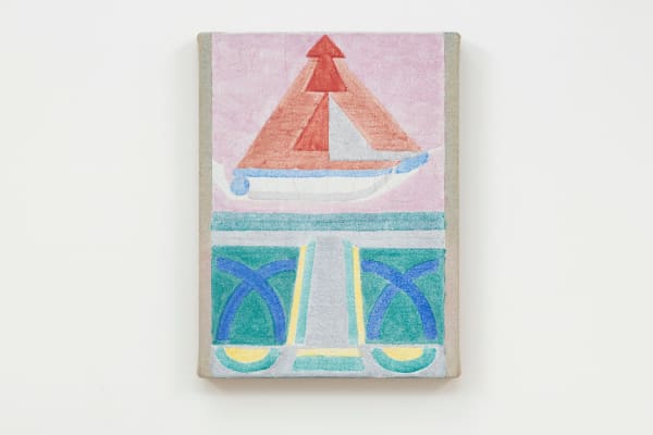
Alfredo Volpi, Untitled, 1960, tempera on canvas, 33.8 x 47 cm (13 1/4 x 18 1/2 in)
Brazil’s most influential proponent of tempera painting was Alfredo Volpi, the son of Italian immigrants, who turned to the medium after seeing examples by Giotto, Paolo Uccello and Piero della Francesca on his travels in Italy. Mixing his own paints became a necessity in the face of Brazil’s extortionate import taxes on artist’s materials, but also allowed for unparalleled control over the quality and brilliance of his colours. Upon adopting tempera as his medium, he simplified his compositions, essentialising the city around him into geometric forms. The exhibition includes an example of Volpi’s iconic Bandeirinhas paintings depicting bunting strung across the streets. Painted in deep purple and electric blue, it depicts a city that vibrates with colour, even as the light fades to dusk.
Ione Saldanha, Untitled, from the series Bobinas [Spools], c. 1971, tempera on wood, 65 x 65 x 34 cm
(25 5/8 x 25 5/8 x 13 3/8 in)Saldanha's Bobinas utilise the spools she saw around the city, used for storing industrial cables. With her interventions, they are transformed into light toys, or delicate flowers. Her Bambus, celebrated in the 2024 Venice Biennale, play with the city on the vertical axis - stacks of buildings climbing up the hillsides of Rio de Janeiro - and on the horizontal axis - a continuous line of architecture experienced only as one encircles the painting and views it from all sides."Ione’s city is constructed not with a builder’s plumb line (there are no rigid straight lines) but with the sensitive cement of color. And this, like the straight line, never appears in its pure state, but is instead porous and sensual matter, the result of thousands of combinations, arrangements, and approaches." - Frederico Morais1
"Due to their material roughness, the Bambus absorb the colour vibration, diminishing it and leaving visible small brushstrokes that slow the gaze … They are not on bamboo but are bamboo itself. The color accumulates on their surface without undoing the knots." - Luiz Camillo Osorio2
Eleonore Koch, Untitled, 1992, tempera, pastel and collage on paper. Paper: 21 x 28 cm (8 1/4 x 11 1/8 in). Frame: 37 x 41 cm (14 5/8 x 16 1/8 in)
Though her figurative practice was a sharp rejection of the geometric abstraction that had come to dominate Brazilian art, Eleonore Koch’s work retains a Brazilianness through her choice of medium, the purity and intensity of colour, her paintings’ heavy atmosphere and her short brushstrokes, like brickwork, positioning her in concord with both Volpi and Saldanha. Koch was Volpi’s only student in the discipline of tempera, using his recipe and pigments to produce a body of work that shares his palette as well as his search for the ‘resolution of the painting,’ her landscapes serving as a field in which to perfect the relationships between line, colour and space.
Detail: Eleonore Koch, Untitled, 1992, tempera, pastel and collage on paper
Working today in São Paulo, André Ricardo works exclusively with tempera, having committed years to studying both the technique and its history. He extends the use of architecture as a structural base to explore geometric and colour relations, and to celebrate the expanses of São Paulo and its bright, clear light, radiating from his canvases."When I’m thinking of chromatic relations, I try to access this memory of color that reminds me of something in my cultural background. The folk culture expressed in our religious celebrations, festivities, music, dance, architecture… Something that is part of our life in some way even if you’re not affiliated with a specific group.I feel that in my paintings, I am looking for other possibilities to see the world. I remember I have these colors inside of myself so when I’m painting, I’m discovering my background, and preserving this pleasure or sensibility." - André Ricardo3
André Ricardo, Untitled, 2024, tempera on linen, 55 x 35 cm (21 5/8 x 13 3/4 in)1. Frederica Morais, 'Bobinas and Emphilhados or the City of Ione,' in Ione Saldanha: The Invented City (São Paulo: MASP, 2021), p. 2742. Luiz Camillo Osorio, 'Ione Saldanha: To Live Color, To Inhabit Time,' in Ione Saldanha: The Invented City (São Paulo: MASP, 2021), p. 503. 'André Ricardo in conversation with Amanda Millet-Sorsa,' White Hot Magazine, July 2023


![Ione Saldanha, Untitled, from the series Bambus [Bamboos], 1970s](https://artlogic-res.cloudinary.com/w_2400,h_2400,c_limit,f_auto,fl_lossy,q_auto/ws-cbprojects/usr/images/feature_panels/images_and_objects/817/cbp_040225_08-copy.jpg)
![Ione Saldanha, Untitled, from the series Bambus [Bamboos], 1970s](https://artlogic-res.cloudinary.com/w_2400,h_2400,c_limit,f_auto,fl_lossy,q_auto/ws-cbprojects/usr/images/feature_panels/images_and_objects/817/cbp_040225_07.jpg)
![Ione Saldanha, Untitled, from the series Bambus [Bamboos], 1970s](https://artlogic-res.cloudinary.com/w_2400,h_2400,c_limit,f_auto,fl_lossy,q_auto/artlogicstorage/cbprojects/images/view/a42775bc743a3f1d2edd23169117b857j.jpg)
![Ione Saldanha, Untitled, from the series Bambus [Bamboos], 1970s](https://artlogic-res.cloudinary.com/w_2400,h_2400,c_limit,f_auto,fl_lossy,q_auto/ws-cbprojects/usr/images/feature_panels/images_and_objects/817/cbp_040225_13.jpg)


![Ione Saldanha Untitled, from the series Bobinas [Spools], c. 1971 Tempera on wood 65 x 65 x 34 cm 25 5/8 x 25 5/8 x 13 3/8 in](https://artlogic-res.cloudinary.com/w_600,c_limit,f_auto,fl_lossy,q_auto/artlogicstorage/cbprojects/images/view/4bc28e70638312a68d3701315b9309ccj.jpg)
![Ione Saldanha Untitled, from the series Bambus [Bamboos], 1970s Tempera on bamboo 183 x 11.5 x 11.5 cm 72 x 4 1/2 x 4 1/2 in](https://artlogic-res.cloudinary.com/w_600,c_limit,f_auto,fl_lossy,q_auto/artlogicstorage/cbprojects/images/view/21a423efc3caea8ed4c49615860ac4e5j.jpg)
![Ione Saldanha Untitled, from the series Bambus [Bamboos], 1970s Tempera on bamboo 154 x 11.5 x 11.5 cm 60 5/8 x 4 1/2 x 4 1/2 in](https://artlogic-res.cloudinary.com/w_600,c_limit,f_auto,fl_lossy,q_auto/artlogicstorage/cbprojects/images/view/a42775bc743a3f1d2edd23169117b857j.jpg)


Join our mailing list
* denotes required fields
We use cookies on our website to improve your experience. You can find out why by reading our Privacy Policy.
By continuing to browse our site you agree to our use of cookies.